Here’s a quick touch up from yesterday… I got a little overzealous and didn’t take a proper “Before” photo so this work-in-progress version will have to suffice.

Return to the Robo-Forest
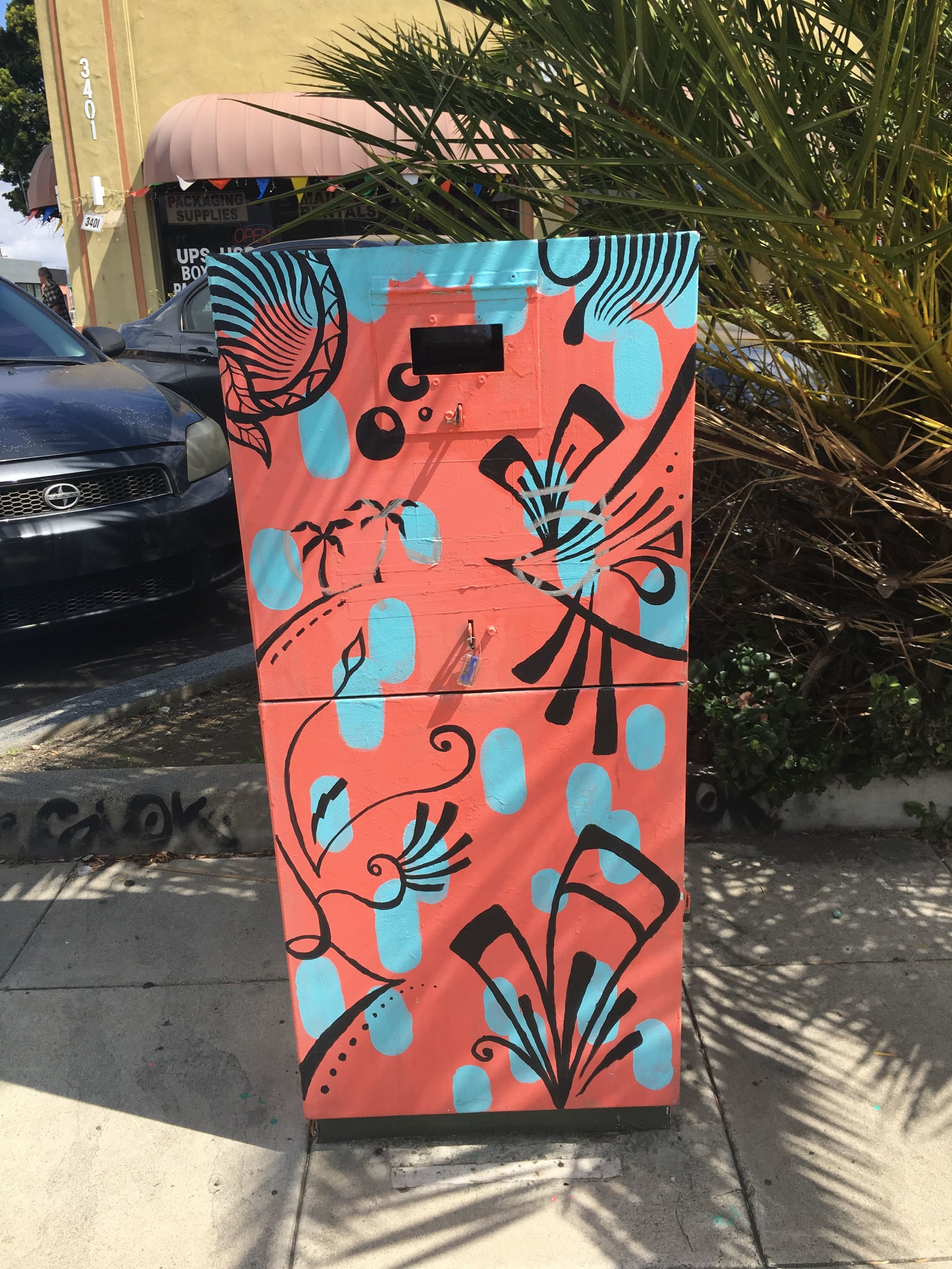
So I’m happy to report I haven’t had to touch up this box in quite awhile, but today marks the second time I’ve covered up an ugly black tag on this beautiful blue box. I’ve said it before but it bears repeating: this is definitely one of my favorite pieces of art in Normal Heights. It might seem a bit small, perhaps somewhat unassuming compared to some of the other utility boxes on Adams Ave but take a closer look and it’s easy to understand why. Dreamy shades of phthalocyanine and ultramarine blues melt into each other, and the artist’s clean lines and whimsical subject matter transport the viewer to a playful and surreal scene—under the canopy of a misty forest where silhouetted robots watch you intensely.
It’s worth mentioning that it took quite a few swatches and lots of careful color mixing to fix this one up. I even had a chance to meet the original artist, @roderickreboton today which was quite a treat. That doesn’t happen every day.
Before and After

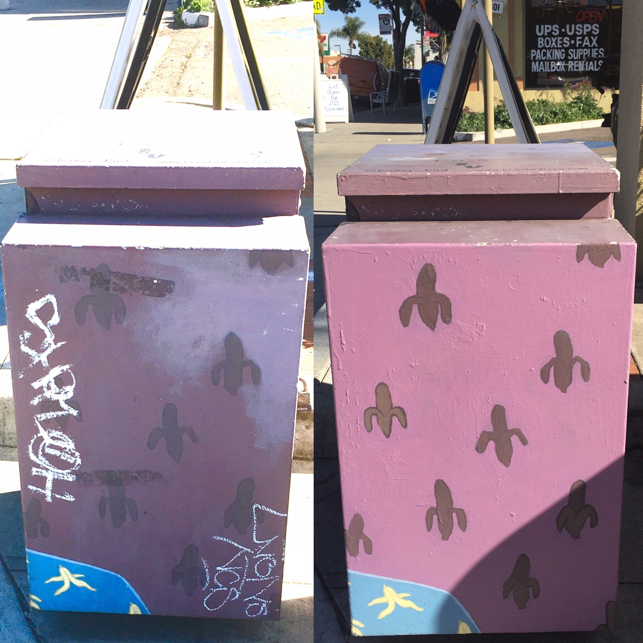
The Box I've Repainted More Than Any Other... Banana Boy!
Well who would’ve thought I’d be back visiting Brise Birdsong’s Banana Boy box a mere 5 months after my last touch up? Just kidding. Of course I’m back — and if I’m being honest, what’s really shocking is that this box only had one tag for me to remove. Take a peek!
Before and After

Banana Boy Box Refresh
This funky little utility box has loads of charm, drawing the eyes of most passersby with Brise Birdsong’s iconic style and imagery. She uses carefully chosen colors, some muted, others bright and saturated in her illustrative portraits and minimalistic patterns.
Unfortunately her work has been tagged and vandalized before and this time was no different. I got to work mixing up a custom color so I could repaint the damaged side in its entirety, then added some touch ups to the two bananas that had been tagged. All in all, I think this refresh turned out pretty good.
Before and After
Horrible Monster Scene Touch Ups
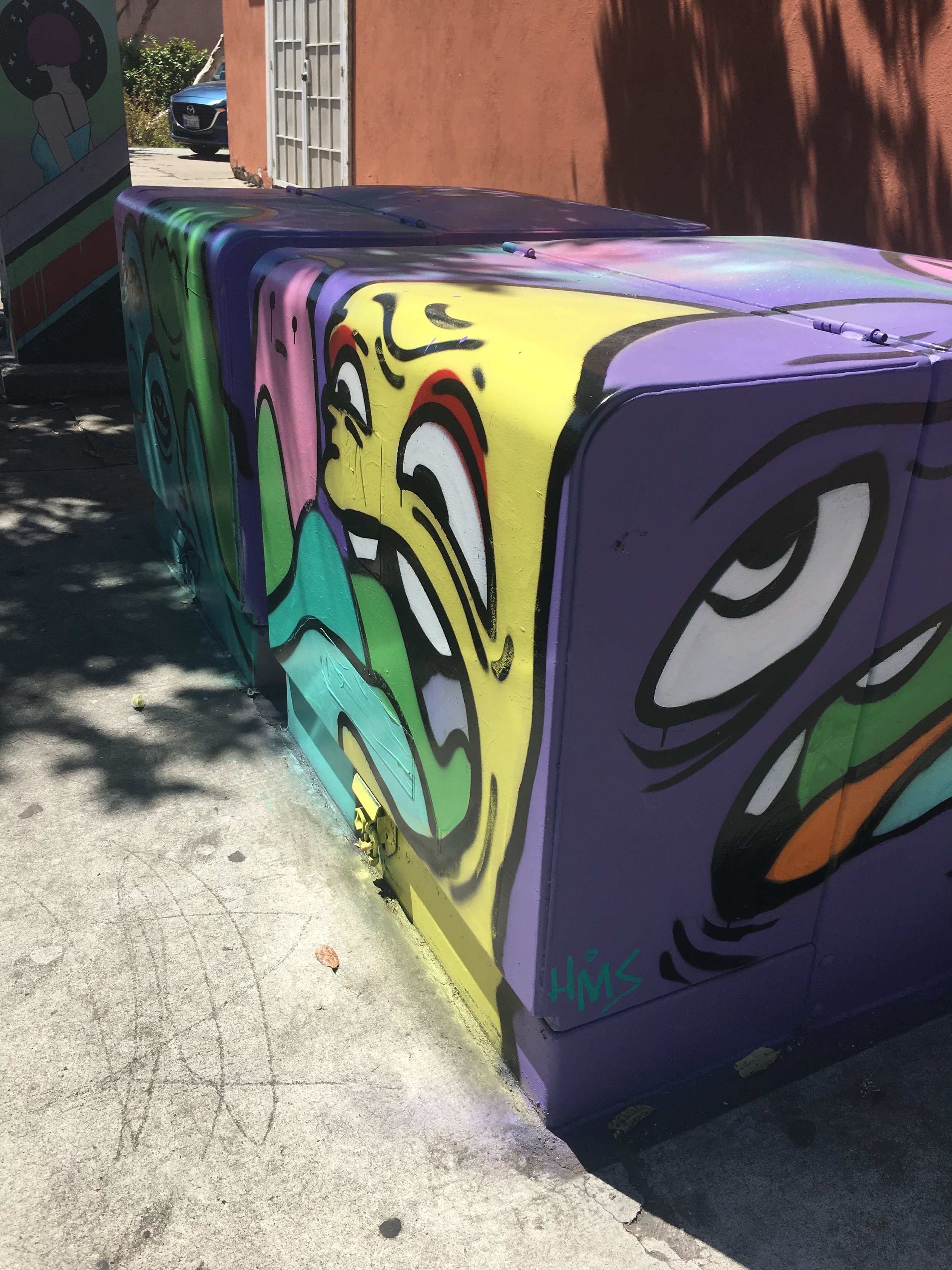
This set of utility boxes feature a lovely palette of bright punchy colors and bold shapes, confined by neat line work that can only be achieved by someone with a skilled hand. Two someones, actually — the talented team is comprised of local artists Bob and Barfo. Don’t be surprised if the imagery looks a bit familiar as they’ve painted what they call Horrible Monster Scene(s) all over San Diego.
This set of utility boxes is located next to Lestats on Felton St/Adams Ave. It’s a high traffic area that sees plenty of people each and every day, which makes it even more attractive to vandals and taggers. Which is just my way of saying these boxes and the 5 others around them require regular graffiti removal/tag cover up. I actually did tag removal two days in a row because I noticed someone had vandalized the exact area I had fixed the previous day.
Before and After
Featured


Back to Brise Birdsong's Box
Did a relatively quick cover up of a dark black tag someone left on one of Brise Birdsong’s painted utility boxes at 34th St. and Adams Ave. You might notice the box looks pretty familiar… this isn’t the first time I’ve given it a bit of a touch up to cover up some ugly marks left by someone else. But regardless of how many times I paint it, the outcome is still the same — the box just looks a hell of a lot better when it isn’t covered in nasty graffiti.
Before and After
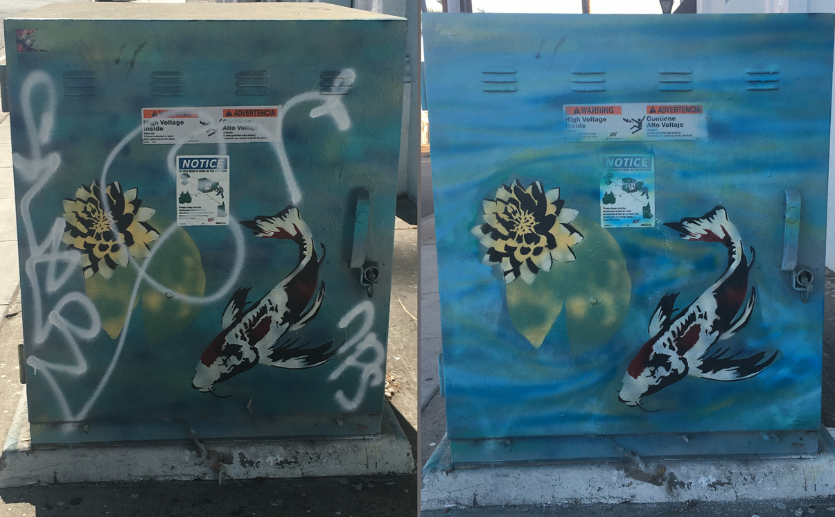
Repaint at the Koi Pond
This large utility box sits next to a yoga studio in the heart of Normal Heights, just off Adams Ave. and 33rd St. It’s placement next to such a tranquil place only underscores the innate tranquility and peacefulness of the scene artist Barbara Cerf painted on it’s surface. Vibrant hues of sky blue, navy and teal blend together softly to create the surface of a pond seemingly shimmering with every gentle ripple of the water. Spotted Koi fish move beneath it’s surface while pale, perfect lotus flowers float weightlessly above them. Needless to say, this work of art doesn’t go unappreciated and always seems to turn heads.
Unfortunately, it recently grabbed the attention of someone who decided it would be an ideal surface to scrawl on, and the result was that the box had been damaged with spray paint on three of it’s sides. I managed to cover and remove most of the offending marks, and it’s my fervent hope that I’ve remained faithful to the original artist’s vision and style. But you can decide for yourself!
Before & After


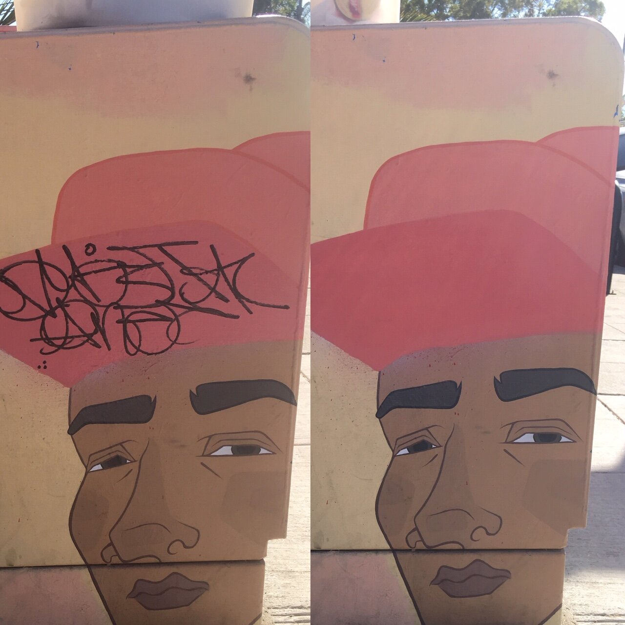
Return to the Naughty Pug
Not all that long ago I removed a big tag from this box, and if you keep scrolling you’ll find the entry on this blog that shows the large black letters I painted over. Well even then this box had this somewhat faded, but still visible orange tag directly on the pug’s face. I didn’t have the right paint colors with me to fix it last time so I came back with my arsenal and knocked it out.

Before and after
Fresh Coat of Paint on All County Fire's Beloved Extinguisher Mural
This one’s been bugging me for awhile now. I’m a pretty big fan of this silly mural of an anthropomorphic fire extinguisher thats been painted on the side of the All County Fire building for just about as long as I can remember. I noticed that the art had been vandalized and tagged pretty severely which in my mind was a pretty shameful thing to do — especially if the perpetrator(s) consider themselves to be artists, or even just someone who believes their tags are meaningful messages. If you have to destroy someone else’s work to get people to notice your message, it’s probably not as important or meaningful as you thought. The skill the original muralist used to paint this piece certainly could be accurately described as “technical mastery” — in other words, its just a really great mural and it doesn’t deserve to languish and fade, covered and obscured by poorly written tags. So I fixed it up a bit.

Before and after
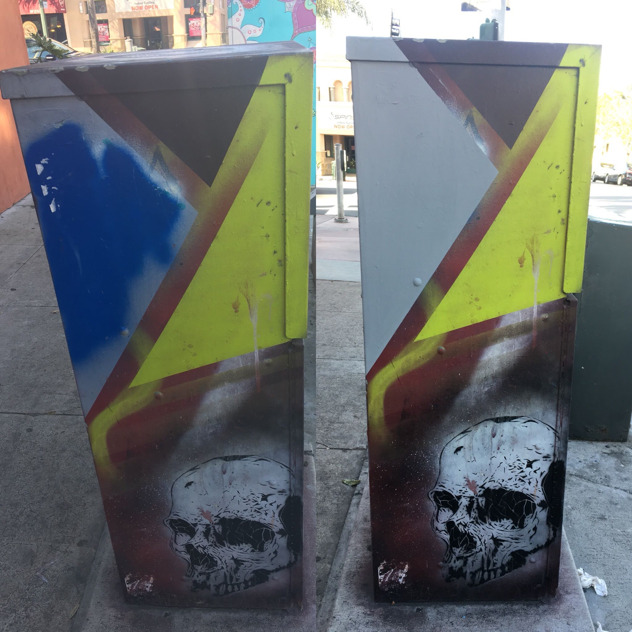
Fiercer than a pack of wolves
Site Location
Felton & Adams Ave.
Had to make a quick stop at this bank of boxes by Lestat’s. Because this little corner is so dark and people really do seem to love to hang out and sit on or conduct some sort of strange business in proximity to the 6 or 8 utility boxes placed there. So naturally, this ugly little tag popped up on one of the boxes artist Stencilface painted, a few of which I’ve touched up before.
Before and After

Shedding a single 'TEAR'
Site Location
Ohio St. & Adams Ave.
This box is one of the older ones we have in Normal Heights. I don’t know when it was painted, but if I had to guess I’d say its at least six years ago. Unfortunately for a lot of public art pieces but especially utility boxes, six years is right around the end of their natural lives. You can get more life of out a piece like that by hiring someone like me to do graffiti removal and maintenance on it, but unless the artist you’ve commissioned used very expensive paints and supplies and the box was expertly prepped and primed, you’ll start to notice the effect time and the elements have.
I set out with the goal of removing the “TEAR” tag and seeing what else I could do to brighten and clean up any other errants marks on this box. Much as I wanted to cover other faint tags (written in orange paint on the pug’s face for example) it was not possible to remove all of them in this one session. So I covered up the most obvious one, and cleaned off any others I could with a melamine sponge.
This box was originally painted by Jason Gould of Visual Art Supply.
Before and After

Some coverup on this cactus scene box
Site Location:
Adams & Mansfield St.
This colorful fruiting and flowering cactus scene box had been aggressively tagged and something needed to be done to restore it. So I grabbed my supplies and headed out.
Original artwork by Taina Berardi.
Before and After
Featured


Robo-Forest Box
Site Location
Hawley & Adams Ave.
Fixed up this nasty tag scrawled across this lovely little box near Black Anvil Tattoo on Adams Ave. & Hawley. Original artwork by Roderick Reboton.
Before and After
Featured

Brightening the Bridge
Site Location
I-805
Touched up some posts on the section of Adams Ave that crosses over the I-805 freeway like a bridge. There were some sloppy dripping red hearts that had been drawn or painted on multiple times, then painted over and drawn again (rinse, repeat). Worst part was that the red paint used was sort of chalky and rubbed off on anything it touched, staining my fingers fire hydrant red.
Featured


Teal and Peach Boxes -- In Progress
Site Location
34th St. & Adams Ave.
These boxes required quite a bit of detail work with a brush in addition to some liberal use of sky blue colored spray paint. I’m not sure when or how that giant black paint smear appeared on this box, but I’m sure it isn’t supposed to be there. These boxes are still a work in progress because so much detail work was needed, but most of the tags have been removed. Watch for an update to see them fully restored!
Before & After


Bob & Barfo Boxes -- Complete repaint!
Site Location
Felton St. & Adams Ave.
These boxes hadn’t been painted any time recently, and over the last three or four years of their lifespan they had taken a ton of damage and wear. They’re in an area that gets a lot of foot traffic all hours of the day and night as they are located on Felton St. right next to Lestats — a late night coffee house that’s a favorite for locals needing a quiet place to work or for those looking for a cup of joe after dark.
When I first surveyed this site to assess the utility boxes (there are around 8 utility boxes at this same location) and determine what would need graffiti removal/coverup, these stood out. After thoroughly cleaning them and scraping away any and all stickers, wheat pastes, and general grime that I could, I realized these boxes needed significant coverup on all sides. Luckily for me, the artists that painted these boxes happen to be personal friends, so when I asked them if they’d be interested in repainting them they graciously accepted. I adore Bob and Barfo’s work, their collaborations really tickle me but even individually, they’re both incredibly talented artists whose work I would urge you to check out.
Before & After

Side view of utility box damage

Front view of utility box damage

Top view of utility box damage

Front view of second utility box

Top view of utility box damage

Freshly repainted!

Top and side view of repainted boxes

Goofy Faces Box
Site Location
3610 Adams Ave.
This box is rather large when compared to some of the others. It sits imposingly on the corner of 36th St. and Adams Ave., right near the neighborhood grocery store that most of us locals frequent. This particular box was repainted to its current design in 2016 — which features playful pastel blue faces with gestural line work that creates the features and expression of each silly face, with two pairs of faces adorning each of the four sides of the box. Unfortunately due to it’s age, the box had seen better days and now the paint had become a bit faded and worn, with a fuzzy blob of grey spray paint covering up an ugly bit of graffiti someone had written over one of the faces. It took me a little time to make my repairs because the box really is so much bigger than one might expect, but thankfully the design the original artist painted was simple enough that matching the colors didn’t take too long and I was able to cover the spray paint and touch up the faded areas and return this box to it’s former glory.
Before and After

Desert Scene Box
Site Location
3436 Adams Ave, San Diego, CA 92116
This small utility box sits right near the bus shelter in front of the 7-11 convenience store on Adams Ave. & Hawley Blvd. It may be small but it’s not easy to ignore, drawing the attention of passersby with it’s brightly colored artwork. Painted by local artist Chris Berger, it depicts a desert scene, with rolling red and gold hills contrasted by a bright green cactus. This box was painted somewhat recently, within the last year or so which fortunately for me meant that it was not too weathered by time and the elements just yet. There were some fairly obvious tags written in silvery white paint pen that obscured the bottom portion of the piece on the side of the box that faced the sidewalk. It was easy to fix but I think the difference is quite noticeable! See for yourself.
Before and After

Exterior Mural at Salon Bordeaux
Site Location
3393 Adams Ave. San Diego, CA 92116
On the corner of 34th and Adams you’ll find Salon Bordeaux, a posh local business in the heart of Normal Heights. The exterior of their storefront features large bay windows that reveal a glimpse into all the glamour and grooming taking place within. On the side that faces 34th St. there are few windows, just a long and mostly uninterrupted section of plaster wall spanning the length of the building. It’s this wall where a lovely exterior mural was painted in muted, pastel shades of grey, pink and navy blue. Unfortunately this proved to be an attractive surface for those seeking to “leave their mark” — so much so that by the time I was able to get out to the site to paint, a new tag had been added. The damaged area was effectively double what it had been, as the new tag was as large as the other two (seen in the before photo) combined, scrawled hastily in thick black paint.
Now unlike the utility boxes I’d been reviving, this mural was going to have to be a very precise operation to be successful. One that tested my technical prowess with color matching, which is a task that can still present a challenge even if you’re a tetrachromat!
My strategy was to pre-mix the three colors I’d be using to cover the damaged parts of the mural using a photo of the piece for color reference. It just made things easier to do this part at home, so I didn’t have to bring so many different colors of paint to the site with me. Another thing one has to anticipate is that the color you’ve mixed will always dry a bit differently than you can readily anticipate so creating a swatch card was just a good idea. With swatches, I could see the color the paint would be when it dried, and make my adjustments and comparisons from there.
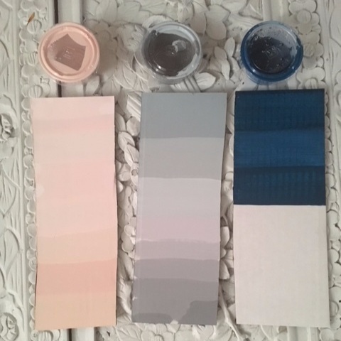
Paint colors and swatch cards
A good friend and mentor of mine, Jeff Robin, once told me something that always pops into my head whenever I mix up a color:
You’ll never be able to mix exactly the same color twice. It’s just not possible.
Now granted, there is some background context to his statement as it was something he said when we were teaching art to a class of teens at High Tech High. While it’s technically possible to mix the same color more than once, it isn’t an easy task or one that you can do without extensive forethought, planning or skill. So the long and short of it is that what Jeff told me is for most intents and purposes, true. What that means for me and what I could reasonably do to restore this mural is simply that I would only be able to match the colors so closely without knowing their actual, exact formulation — but I know myself and my eye is developed enough that I was certain I could attain a remarkably close match to the original paint colors.
On my swatch cards I created a swatch every time I made any adjustment to the paint color I was mixing. As you can see, the pink and grey cards are covered with swatches from top to bottom, and even a few on the back. With the exception of the top three swatches, these colors represent minute adjustments I made to the color while at the site, comparing each swatch to the color I saw on the wall, then making my adjustment until I was satisfied that the dry paint color on the card was as closely matched to the color on the wall as I could make it.

Pastel pink color swatches
Interestingly (but unsurprisingly) the grey required much more adjustment than the pink — and a probable explanation for that is my own personal color preferences. One of my favorite fine art professors in college (and a wonderful local artist and small business owner of the popular North Park boutique, Pigment), Amy Paul explained to our Color Theory class that an individual can differentiate more shades of the colors they prefer. So that is to say, if your favorite color is blue, it’s likely that you could detect more subtle differences in shades of blue than you could with red or some other color. Time and time again I find that this little piece of knowledge is most definitely true. I love reds and oranges and as my artistic eye has developed over the years it’s become ever so apparent that I can easily perceive many nuanced shades so long as they contain red — far more than I can for other colors. So if I had to hazard a guess as to why the grey required so many more adjustments before I matched the original color versus the pink, I’d say it’s because I just don’t like cool, neutral colors like that grey as much as I like warm red-orangey tones like the pink.

Grey swatch card adjustments

Back side of my grey swatch card with more adjustments and the final shade I would be applying to the mural.
I was pretty satisfied with the results of this color matching, paint mixing challenge that I had on my hands in trying to restore this mural to it’s original state. But you can judge for yourself if my execution was lousy or expertly done. Because of how we perceive colors and light, photos often don’t capture what we will truly see in person when we view a piece of artwork for the first time. In fact, terrible lighting can change the colors we perceive and make an expertly painted work appear disharmonious or particularly discordant visually. So while I’ve done my best to capture this mural in the same light conditions for my before and after photos, it’s best if you just come visit Normal Heights and see this piece in person. Take a stroll down Adams Ave. and you’ll see countless painted utility boxes and murals — most of which, I haven’t had to remove graffiti from. But I hope (and like to think) that if I’ve done my job right, you won’t even notice what I’ve fixed.
Before and After

StencilFace Boxes
Site Location
Felton & Adams Ave, near Lestats
Artwork by Stencilface.
These spooky, detailed boxes needed a few touch ups before they were back to their former glory. Over time, they got pretty dirty and this is a high traffic, low-light (at night) location so naturally they got tagged, covered in stickers and wheatpastes. I scraped most of the gunk off and taped off the sections that had been spray painted to cover up tags, then repainted them to match the original colors. Not half bad right?